Choosing the right Neutrals

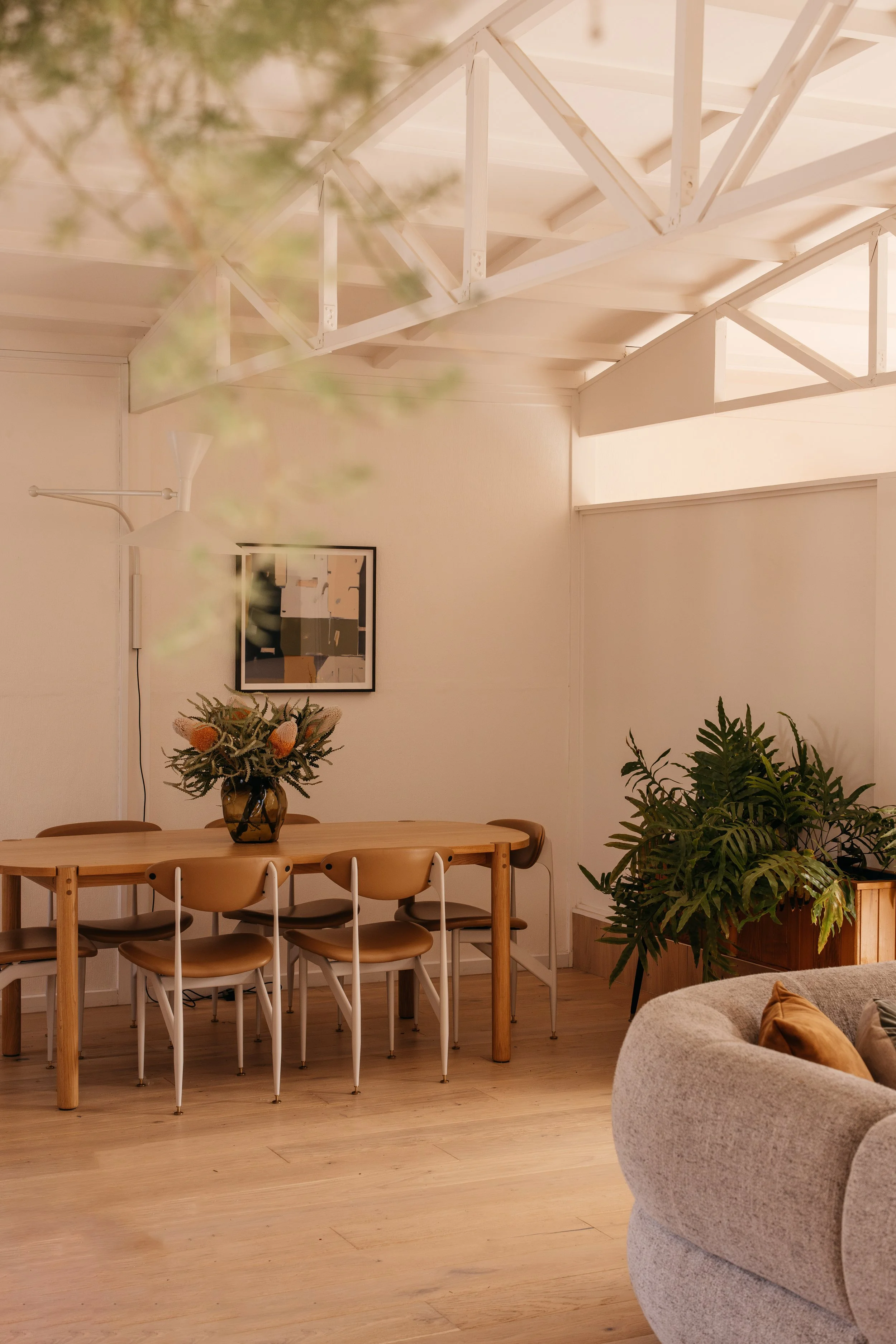
Pointside, Bayside Melbourne
Painting your home is one of the best ways to make considerable impact, with minimal investment. Whilst we love colour, neutrals also have their place and we quite often have a base neutral for hallways, stairways and on occasion, entries. But which neutral should you pick, with literally 1000's to pick from?!!
It really is a process of elimination, with your home orientation often a good place to start - is your home positioned with a North, South, East or West orientation? This will indicate the type of light you are getting into the rooms you are wanting to paint.
Here is some information for you regarding orientation aspects and natural lighting:
• Easterly lighting is strongest in the morning and tends to have a warm, yellow cast to it.
• Northerly lighting is the strongest light, which lasts throughout most of the day and has a neutral to cool tone.
• Southerly lighting is a diffuse light, which lasts throughout the day and has a cool, blue-grey tone.
• Westerly lighting is only intense in the late afternoon and has a very warm, orange-red tone.
This impacts our perception of colour in the following way:
• Warm light renders warm colours better, making them look more true and vivid.
• Cool light, such as light from the South, rendered cool colours better.
• Neutral, Northern daylight renders colour more neutral.

Scandi Hut, as featured in Design Files and Country Style
As you can gather, it is quite a science and there is an art to selecting the right paints and testing in situ is a big part of the selection process. Testing is key, I can't emphasise that enough - a little swatch just isn't enough - we also need to ensure we are looking at the colours vertically, not over them - an obvious and simple point, but often forgotten part of the process.
Other factors include the purpose of the room and how you want to feel in that particular space - Do you want to feel relaxed, focused, energised?
Further considerations are the architecture and existing materials and colours that need to be in sync with the paint colour - they all need to talk to each other!
Grant House - Mid-century Modern House in Bayside, Melbourne
In essence, there is a mood board for every room, developed from all the pieces of the puzzle in the room. A great idea is to put together a mood board of all existing furniture and materials, so you can then start playing with the paint cards, switching them in and out 'til you land on the right one.
Whilst we tend to know the colour family we are after, the exact colour selection is often the last piece of the puzzle we select. This is very normal for us, to select the final colour in situ for each specific project, where we will paint large samples in the room to determine the best selection with all other things considered.
Here are some of our recent favourites:
Dulux Buff It
Technically this isn't in the neutral section, as it has a red/orange base. It's a lovely neutral with depth and a pink/blush undertone - it has an elegance to it and has worked really well in a couple of projects recently, including kitchen cabinetry (in half strength due to lack of natural light, so it is behaving like full strength).


Porters Paints - Rubble
A great beige neutral, very earthy and moody, but not too light or dark, a goldilocks beige :-)


If you are not sure which direction to go, our design consultation can help you, ensuring you don't waste time or money picking the wrong colours for your home - let's get it right the first time round.
We visit your home and take all things mentioned above into consideration to select the best options for you. Paint cards and paint samples are also provided and we also tackle any other niggling problems you may have during the 2 hour consultation (which size sofa, what colour curtains, what rug should I get for eg) and ensure the rooms are cohesive and tell your story.
The journey of design sees most of our clients embrace colour more and more as we dive deeper - often the end point is very different to the start of their colour journey and it is a wonderful thing to observe, seeing our clients so happy that they trusted our colour design selections.
Wishing you all a wonderful long weekend ahead!
Agi and Carlie
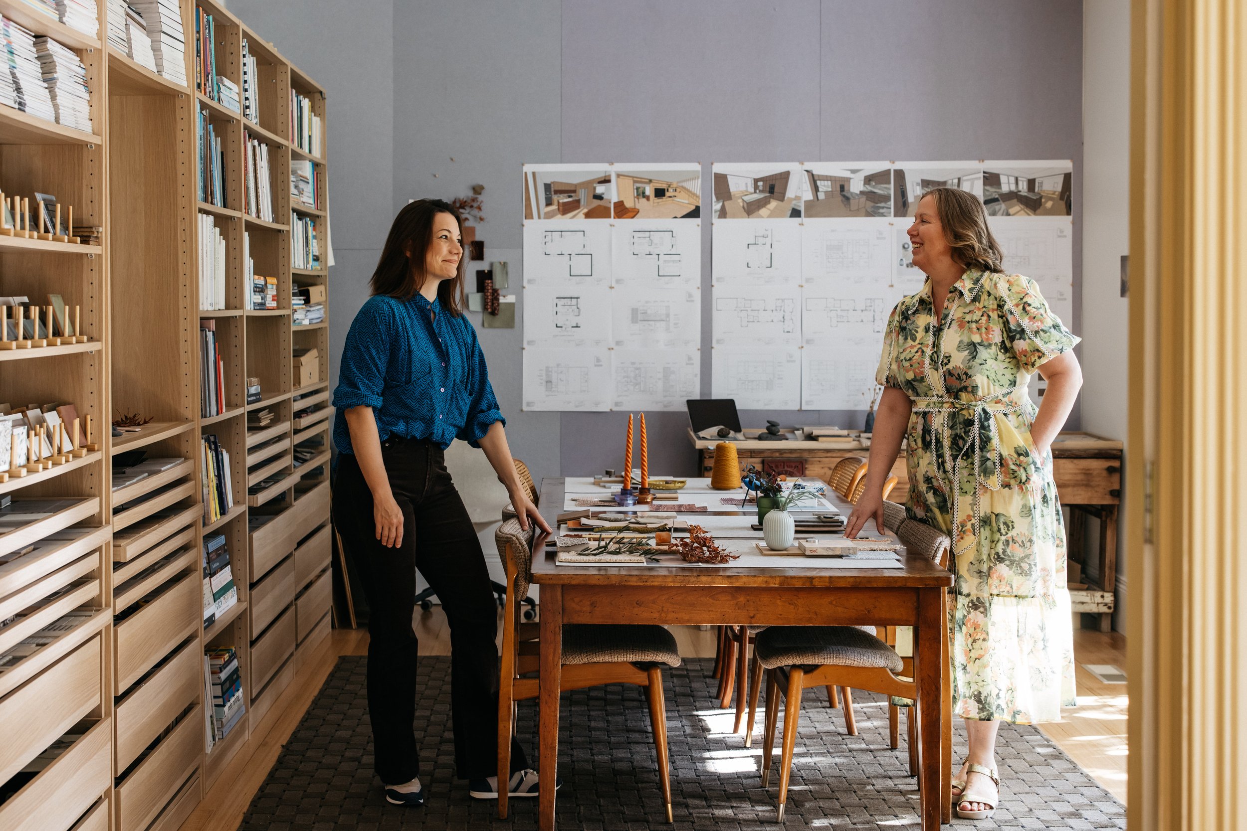
Hygge Design Studio Bayside Melbourne